

Field Design Practice is a practical design training platform led by industry practitioners, helping early-career designers develop specialized expertise through hands-on learning. Alongside vocational courses, Field hosts industry talkshows that encourage dialogue, exchange, and stronger connections across the creative community.
Field was established to help Vietnamese designers define their own creative direction through practice-led learning and critical thinking. By fostering an open learning environment where individual perspectives are continuously explored and refined, Field supports long-term professional growth while contributing to a more connected design culture in Vietnam.
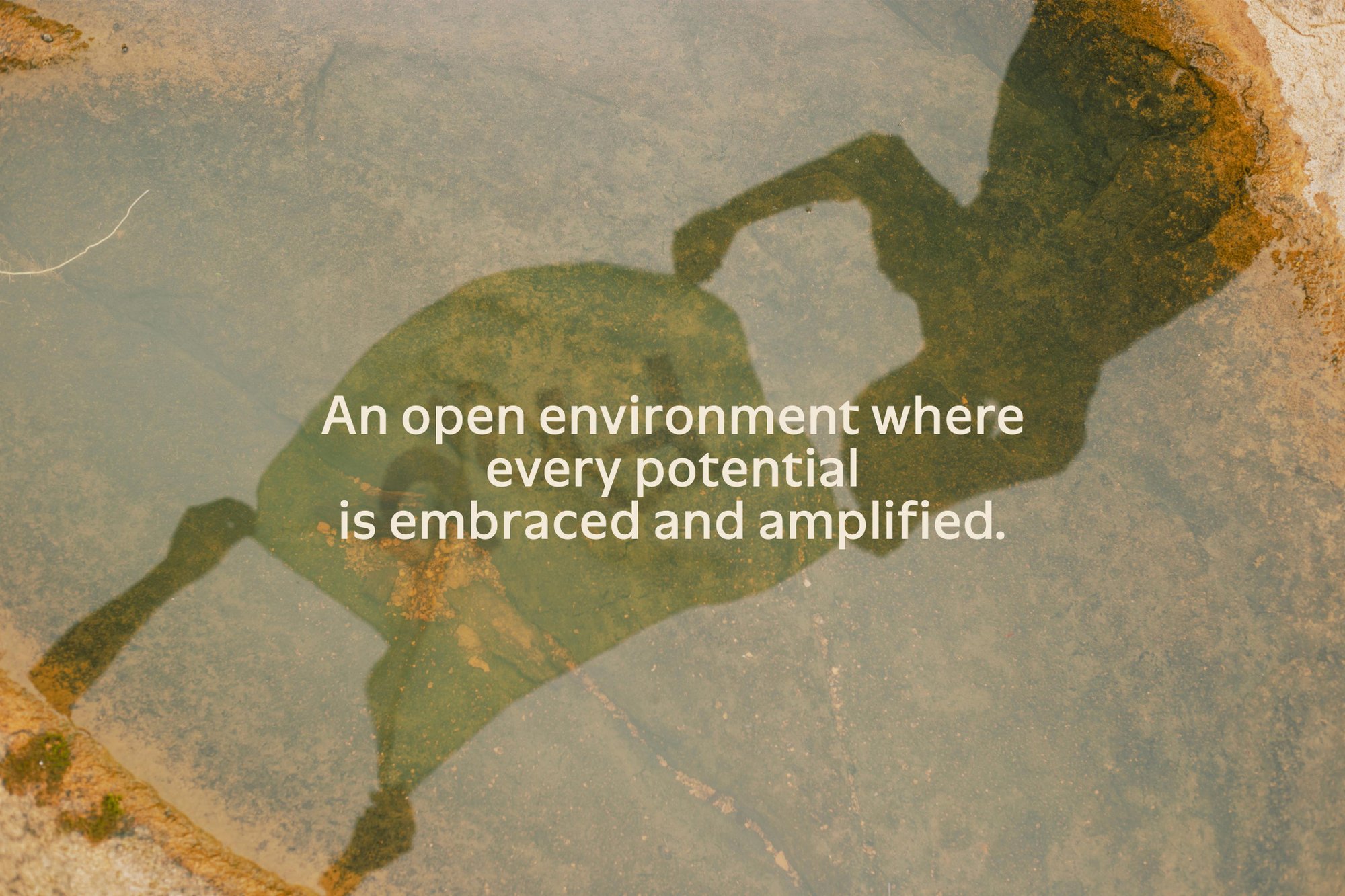
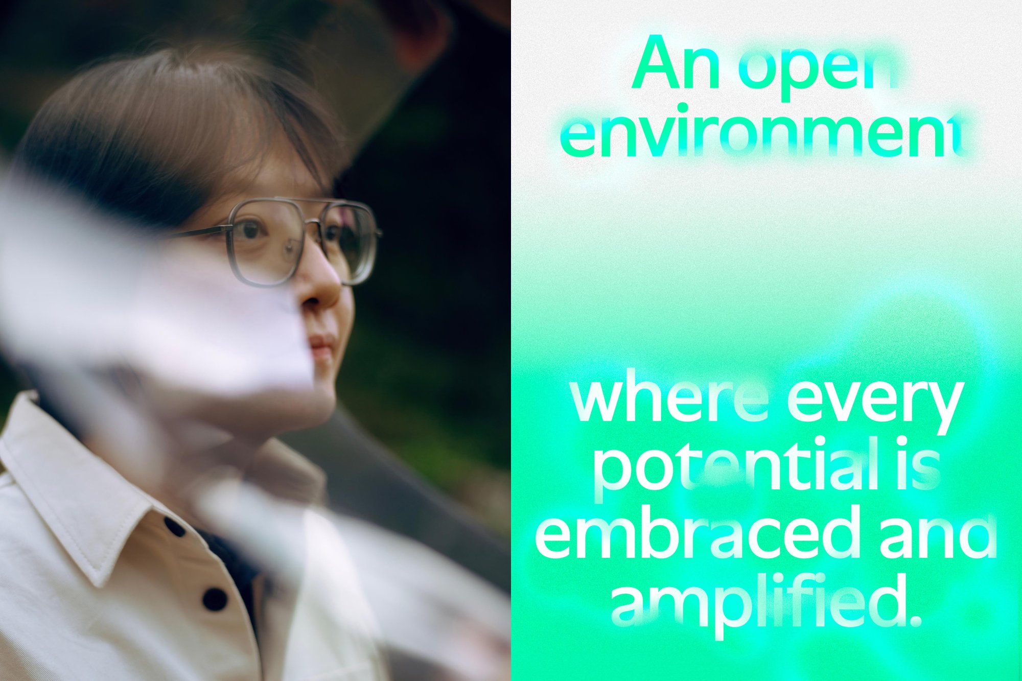
An open environment where every potential is embraced and amplified.
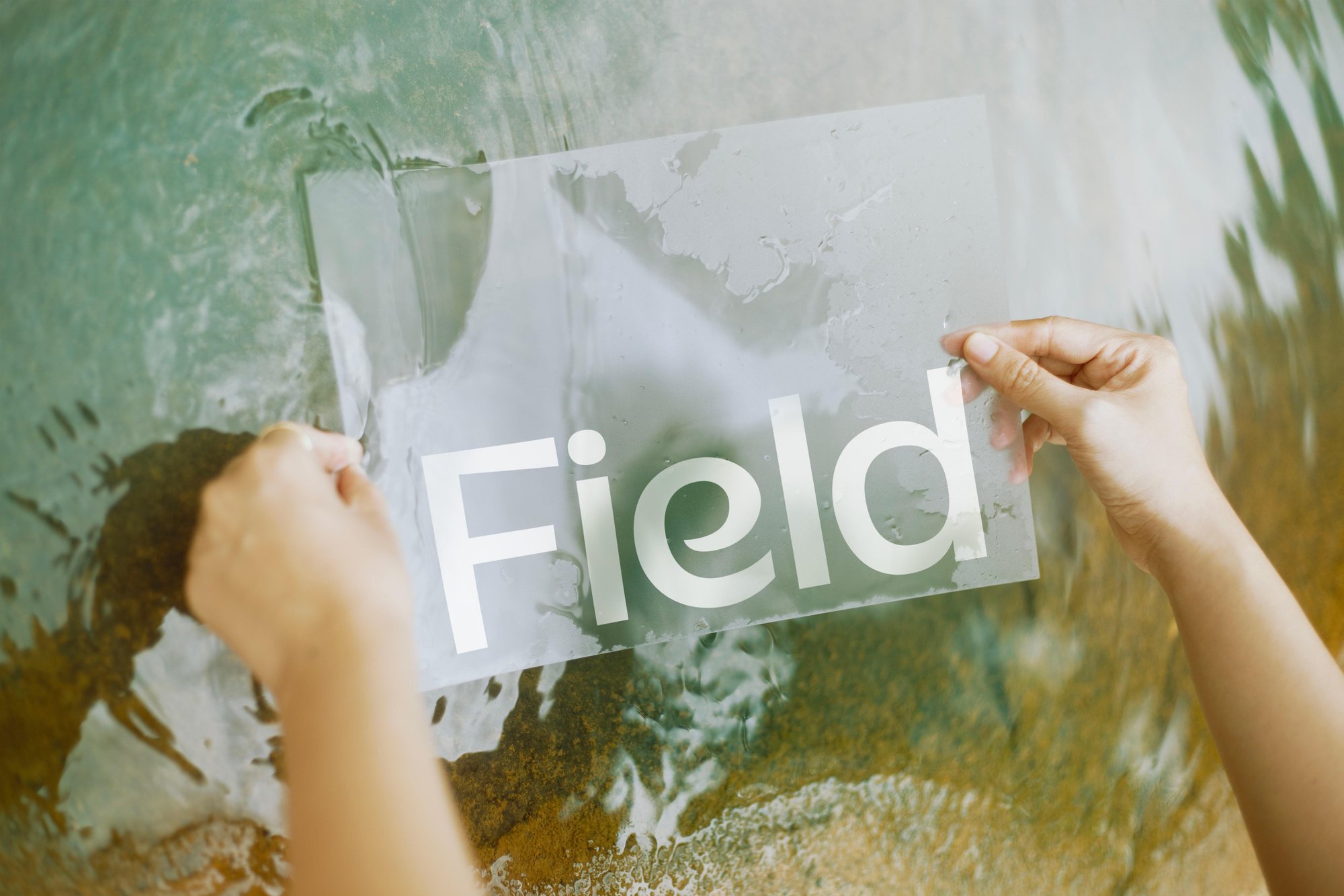
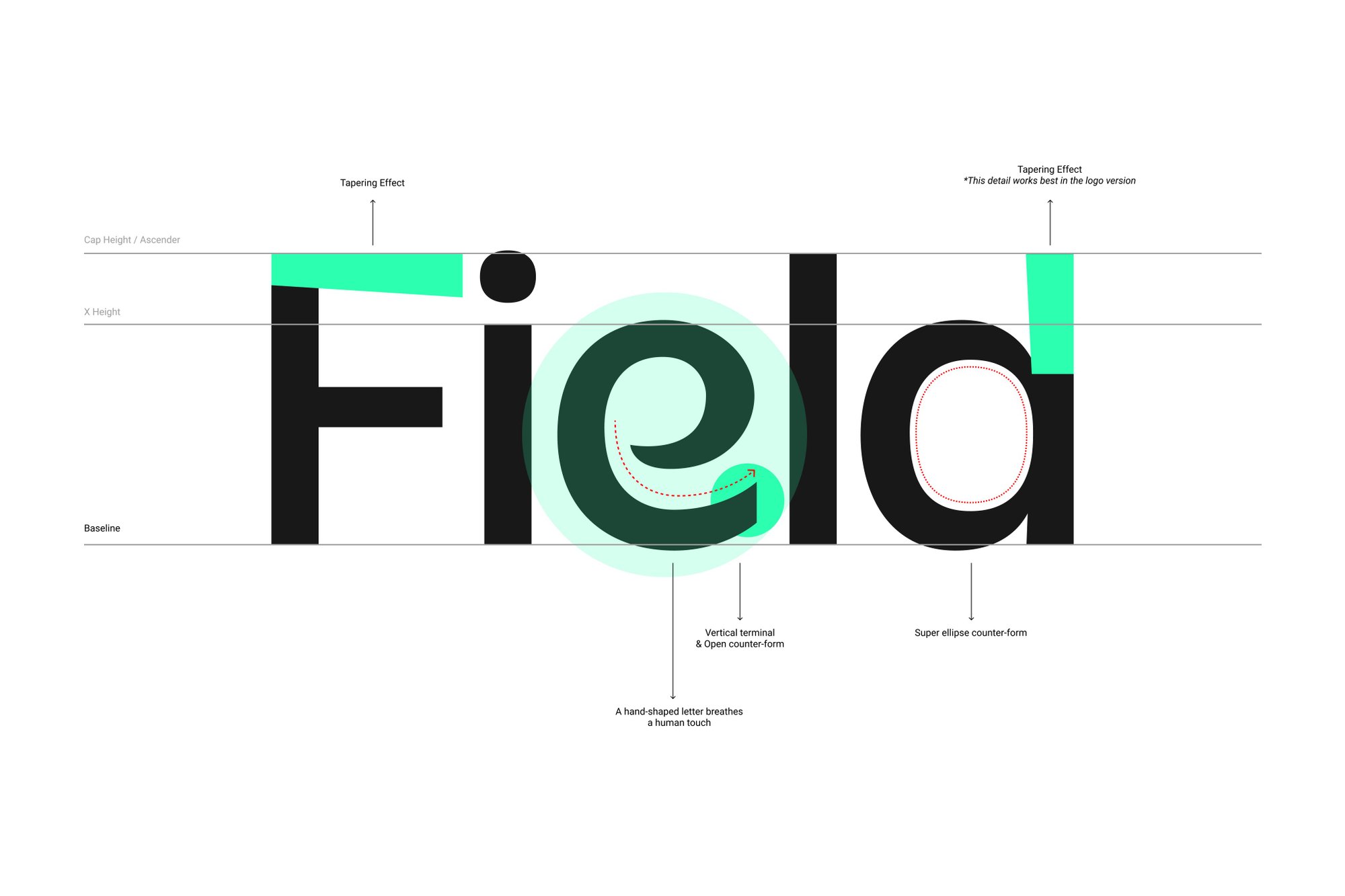
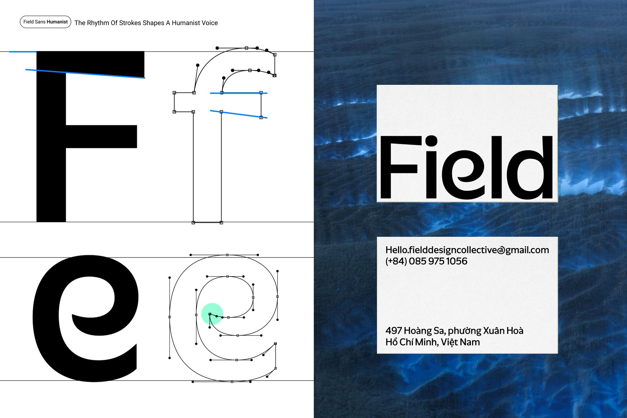
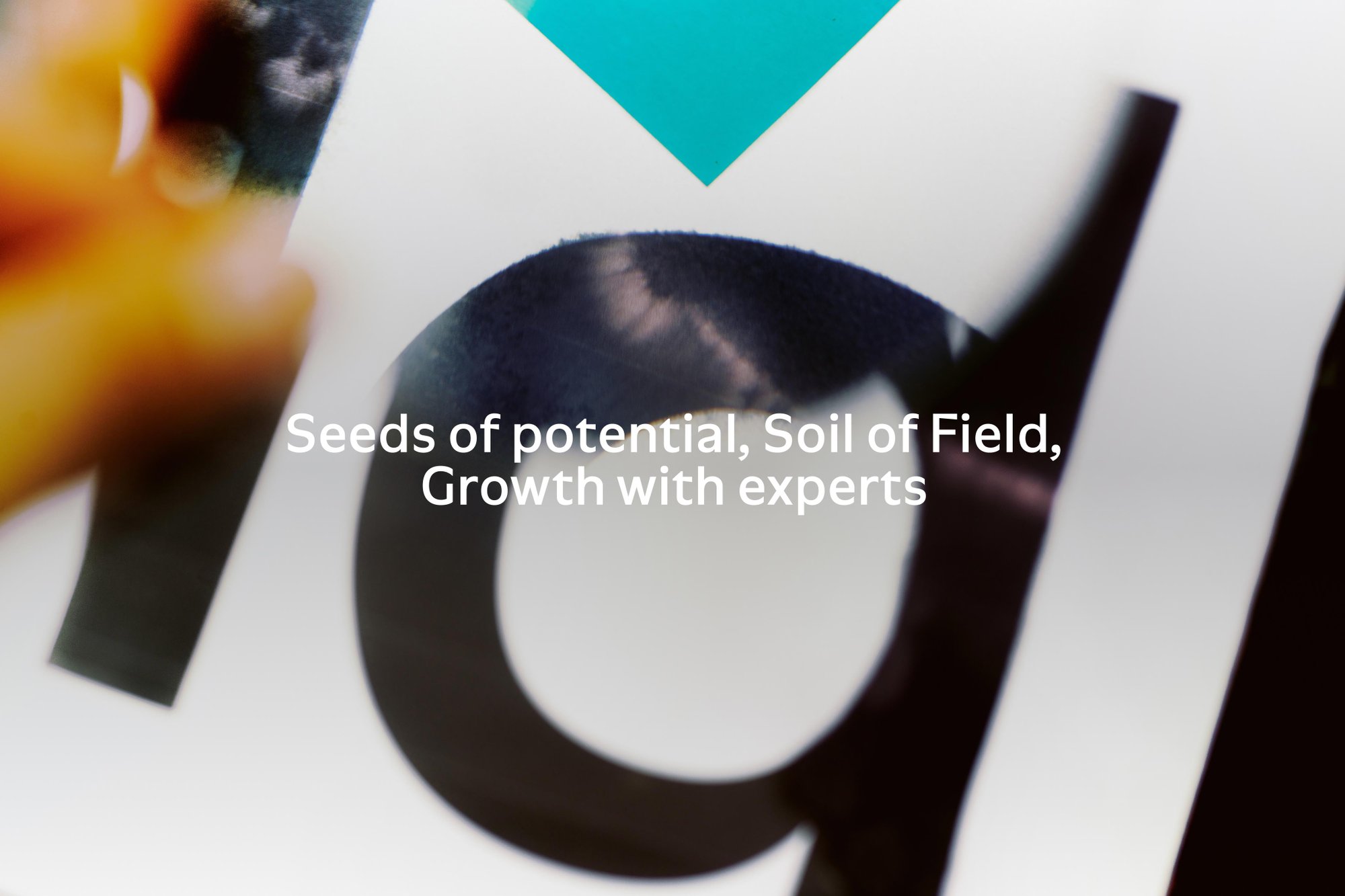
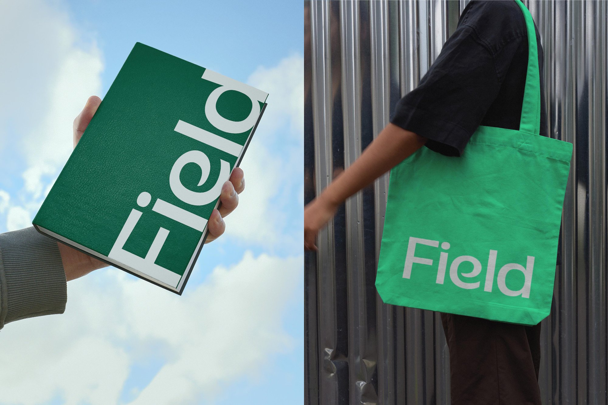
The Field logotype reflects the platform’s two core principles: human potential and structured practice. The custom-drawn e, developed through lettering and calligraphic techniques, introduces a distinctly human gesture that represents the individuality of every learner. In contrast, the remaining letterforms are constructed with a contemporary sans-serif approach, providing a systematic framework that balances consistency with creative freedom. The logotype also serves as the foundation for Field Sans, the platform’s proprietary typeface.
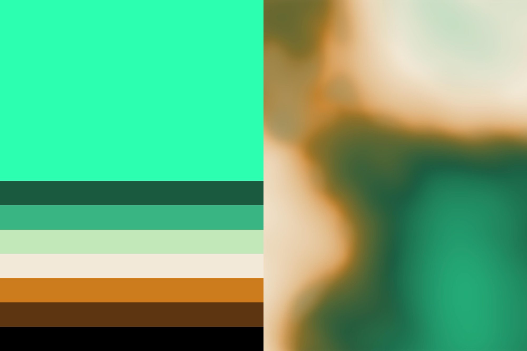
Extending these ideas into the visual identity, Field developed a generative visual system that produces evolving colour patterns as its primary graphic language. By adjusting variables such as colour, rhythm, intensity, and density, the system generates a wide range of visual outcomes while maintaining a coherent identity. Rather than relying on fixed compositions, the identity behaves as a living system, capable of adapting across different contexts while remaining unmistakably Field.
Extending these ideas into the visual identity, Field developed a generative visual system that produces evolving colour patterns as its primary graphic language. By adjusting variables such as colour, rhythm, intensity, and density, the system generates a wide range of visual outcomes while maintaining a coherent identity. Rather than relying on fixed compositions, the identity behaves as a living system, capable of adapting across different contexts while remaining unmistakably Field.
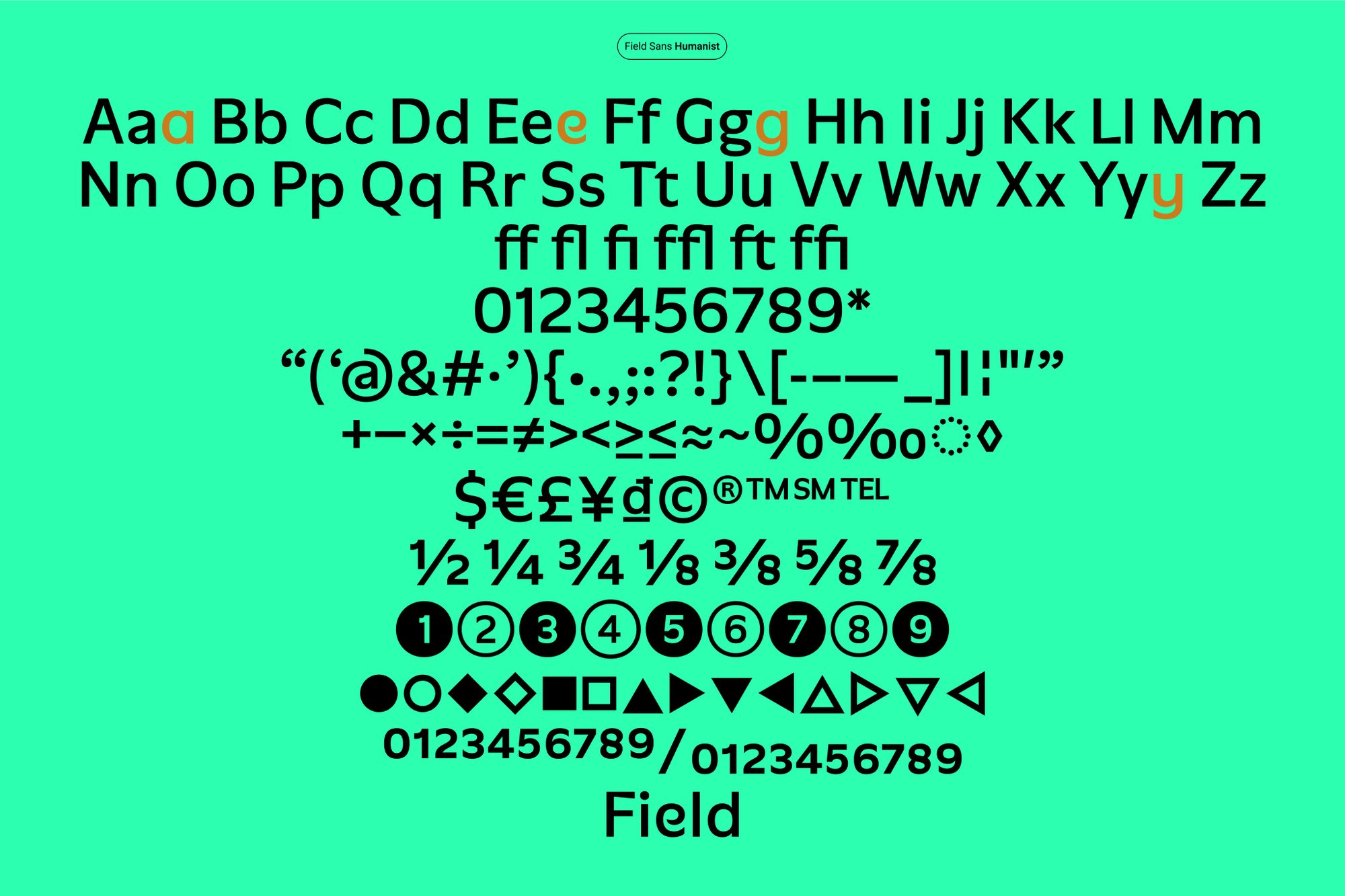
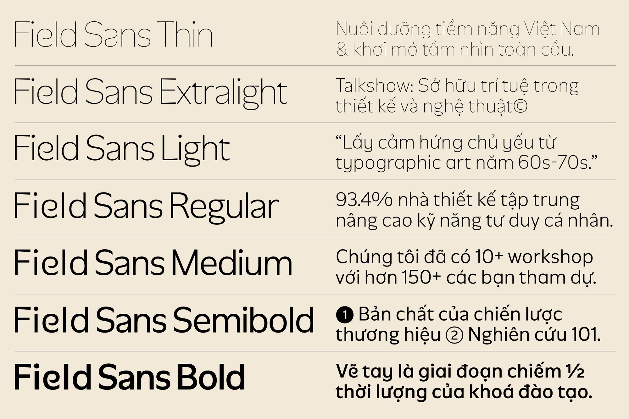
Field Sans extends the visual principles established by the logotype. Its sans-serif letterforms are designed to feel both innovative and timeless, while selected characters introduce a subtle lettering influence and a more human touch. Together, these contrasting qualities create a typeface that balances logic and creativity. Designed as a seven-weight family, Field Sans ranges from Bold to Thin, providing a flexible typographic system that can adapt across different applications while maintaining a consistent visual character.
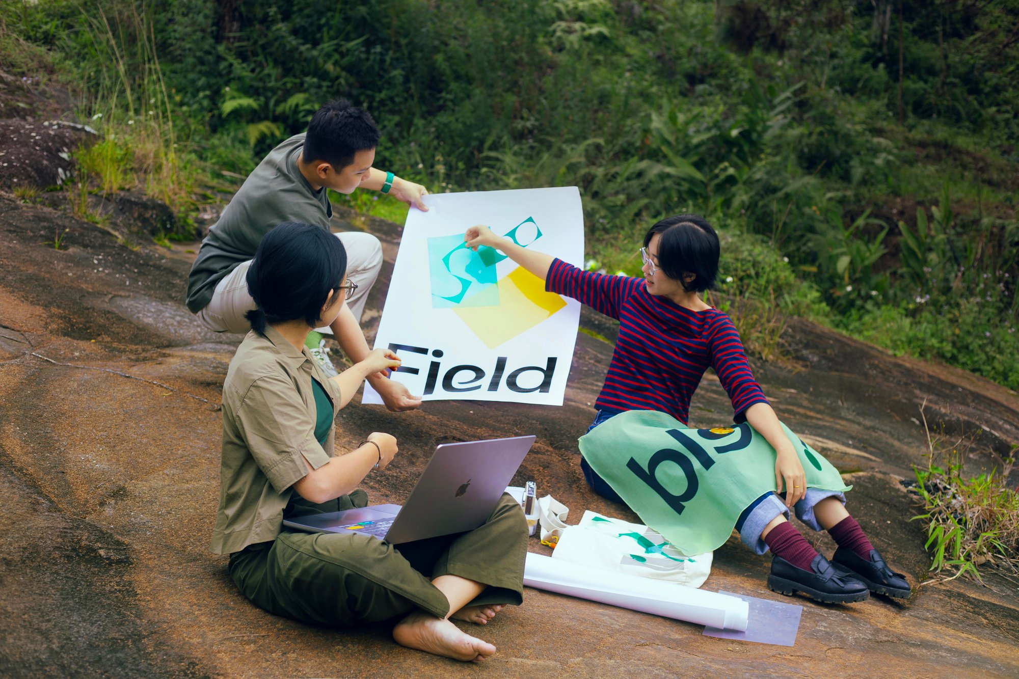
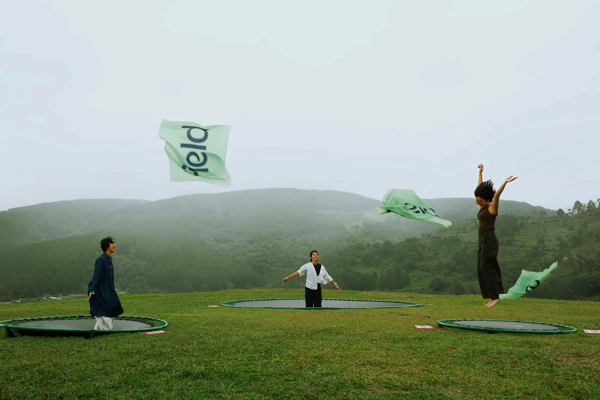
Field Design Practice’s photographic direction reflects a creative practice deeply connected to nature, representing a new generation of designers committed to sustainable, environmentally conscious, and socially responsible creativity. The system focuses on curiosity, connection, and experimentation, captured through moments of observation, exploration, and creative practice.
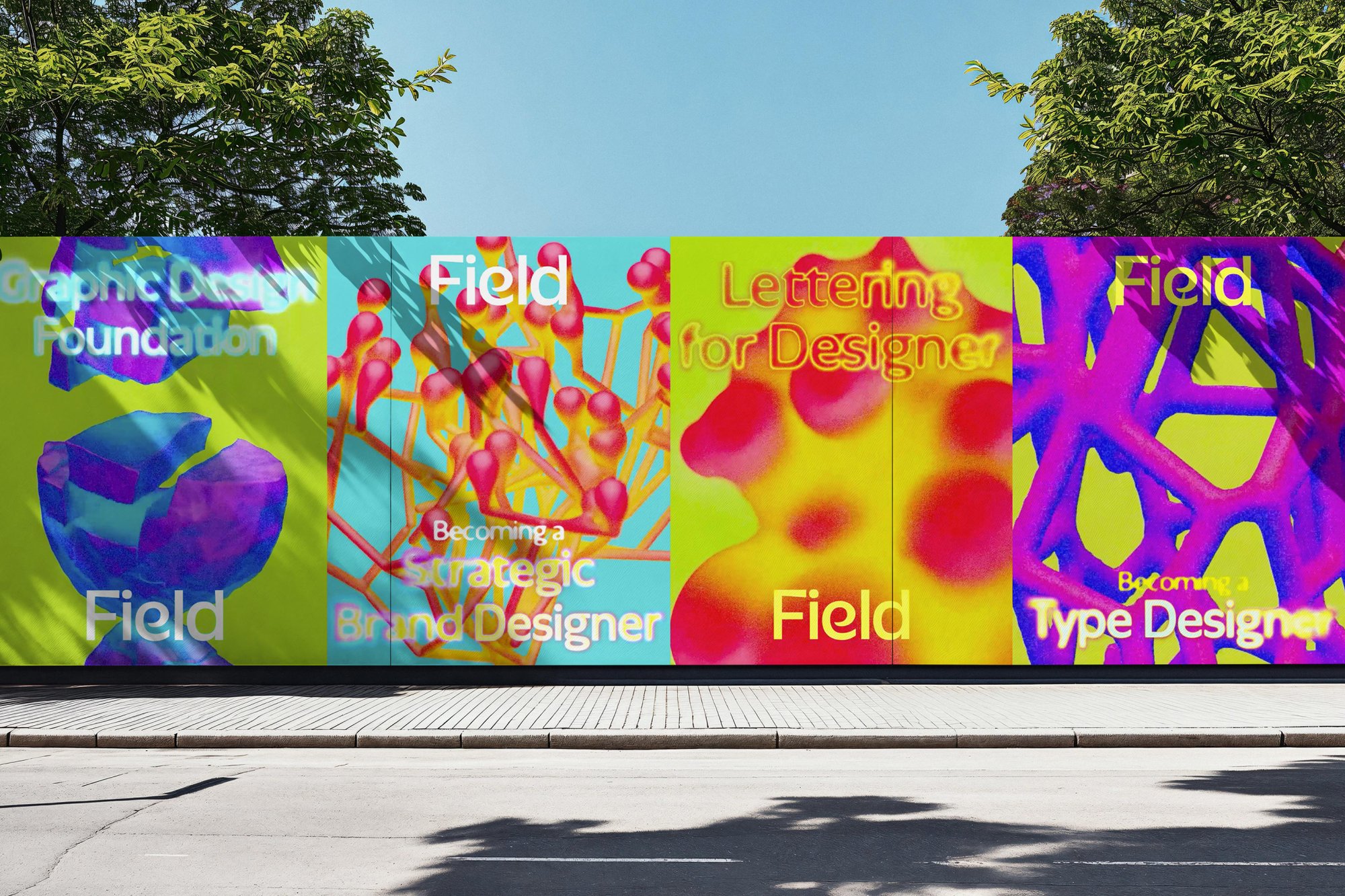
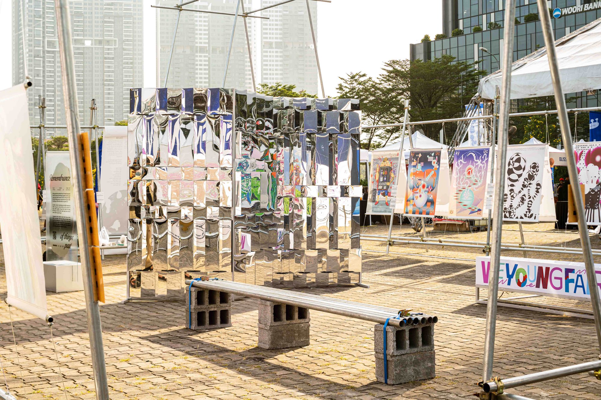
Promotional posters for Field’s programs extend this visual language through symbolic imagery that represents professional practice and expertise. These elements are composed within the rhythm of Field’s generative visual system, creating a consistent relationship between the course communications and the wider identity.